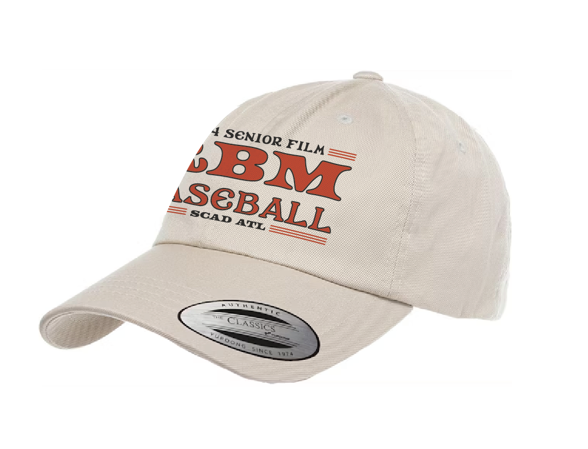
As a designer, working with others outside of my own schooling is essential. That’s the case with Rubber-Band Man. Set in the 70s, it centers around a young man that due to accident at his father’s office store, his body begins to take on various rubber bands.

Rubber-Band Man

Throughout this project, I conversed with the director, Tania. She broke down stylistic inspirations she had from a 1976 Spinners song, as well as the Spider-verse movies. She stressed the importance of something that can emulate the moment of rubber bands, stretching, and squeezing.
-
Rubber-Band Man is an interesting story that was directed by Tania McCrary. Tania was compelled to reach out because of my work with HYE, so with this client, I made sure to honor that trust.
It being set in 70’s meant the type treatment to be playful, and groovy.
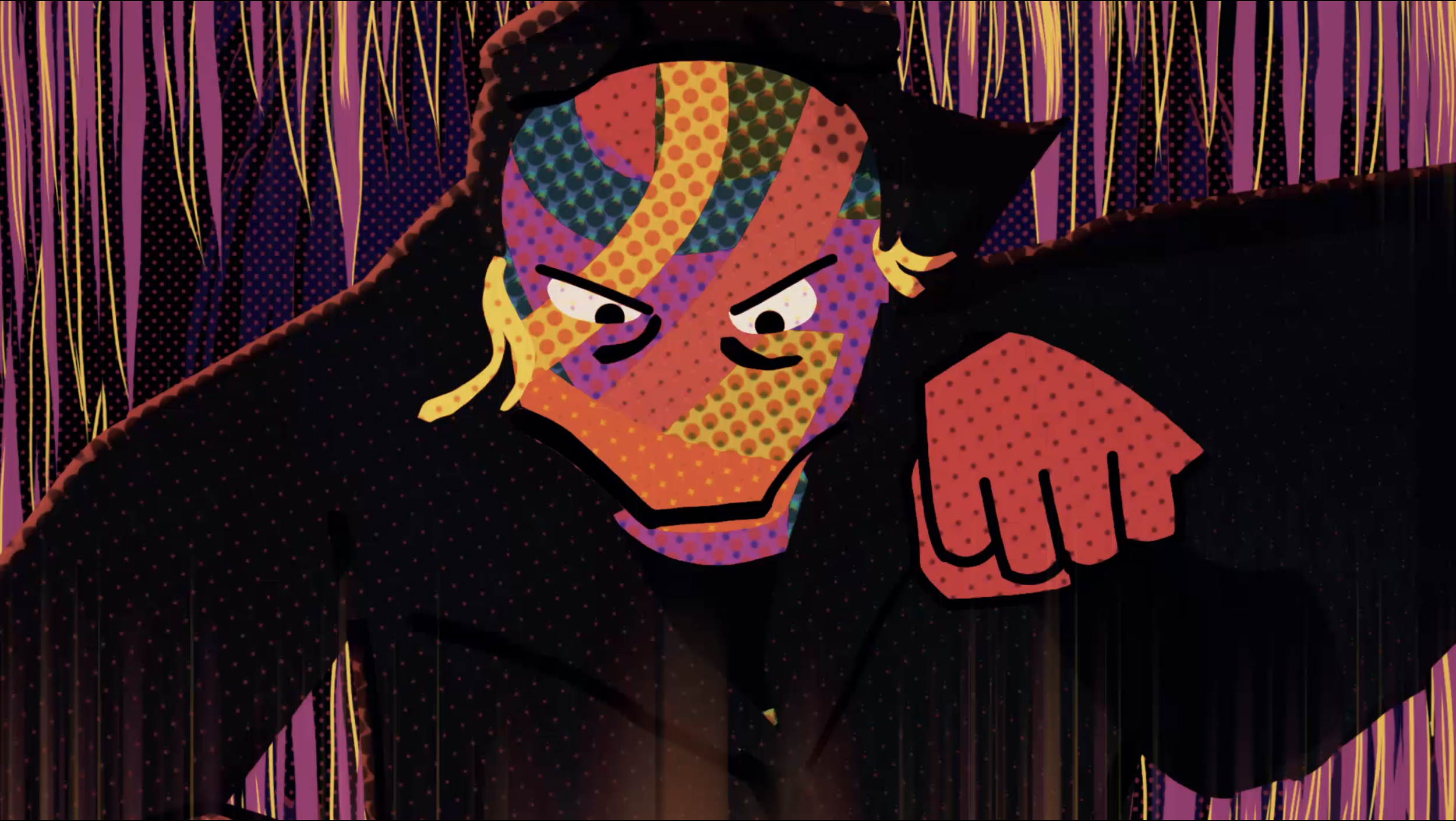
The film’s artstyle being so halftone heavy, meant the title had to reflect it. Tania loves comic books, and wanted to feel a familiar nostalgia when viewing the film.
After receiving stylistic inspiration in the form of some Spidey comics from the 70-80s era, I went to work.
-
At the time, “into the Spiderverse” mania was in full swing, so decided to blend that the distorted & colorful title card with the world of Rubberband Man.
After experimenting with sans serif, slab serif, and serif options, some interesting ideas appeared right before we hit a creative wall. We then took what worked, and left what didn’t. She liked the motion, the textures, and all the different distortion that were present in each iteration.
-
Through the implementation, the why is to establish cohesive visual communication. This provided solutions that generate constant excitement for merchandise, events, and announcements.


Type is loud, vibrant, but also vintage due to the setting. That’s a serif type combination, heavy drop shadows, saturated colors with grainy textures to produce something that felt lived in.

at that point I incorporated textures, then found that while the movement was right, the type needed to be the star.